How Riri Rhythm evolved
Riri Rhythm evolution
Hello.
In this first devlog I'd like to share how Riri Rhythm evolved from my first idea to its current form. (which will keep evolving as I continue development)
Around the last week of February I got inspired to make my own rhythm game, after playing the amazing Hinotori Rhythm game by nullrefrepro.
On the other hand, I had been following Ririsya for some time, since I found her through her Calliope remix contest entry. I think her music is beautiful and more people should listen to her work, so making a game showcasing it was only the natural thing to do!
Early prototype
When I first wrote down the concept for the game, it consisted of three main elements:
- Have Ririsya as a controllable on-screen character,
- A standard rhythm based play and,
- Some sort of hazard blocking/avoidance that required a different type of player input.
For the first prototype of the game, I made the play area horizontal with the character notes coming from the sides and projectiles shooting to the character in the middle of the screen.
The player could control an umbrella to cover Riri from the hazards, while pressing the correct keys to the beat as in any rhythm game.
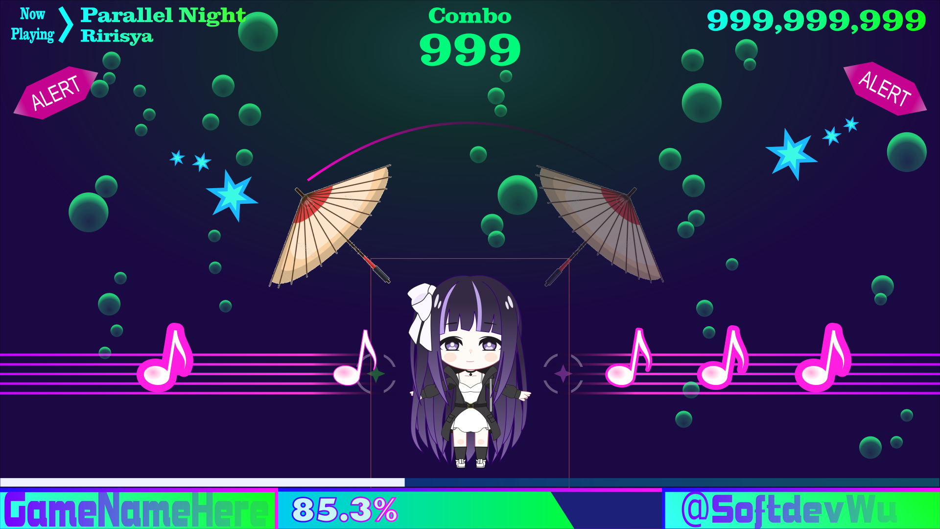
However, after some playtesting I found it difficult to get the timing right, since the notes were coming from different places in the screen in different directions and without a clear indication of the 'hitbox' in the sprites.
Trying New Layouts
After thinking about it, I decided it was best to stick to a more standard layout, with the notes coming from the same side of the screen, allowing for better reading of the note order.
So in the next version of the layout, the notes came down from the top of the screen in their own 'notes zone', while the character and the hazard avoidance part of the game was moved to the zone on the side.

At this moment I realised that there was a lot of wasted screen space by having the game on a horizontal orientation, so changed it to a vertical orientation.
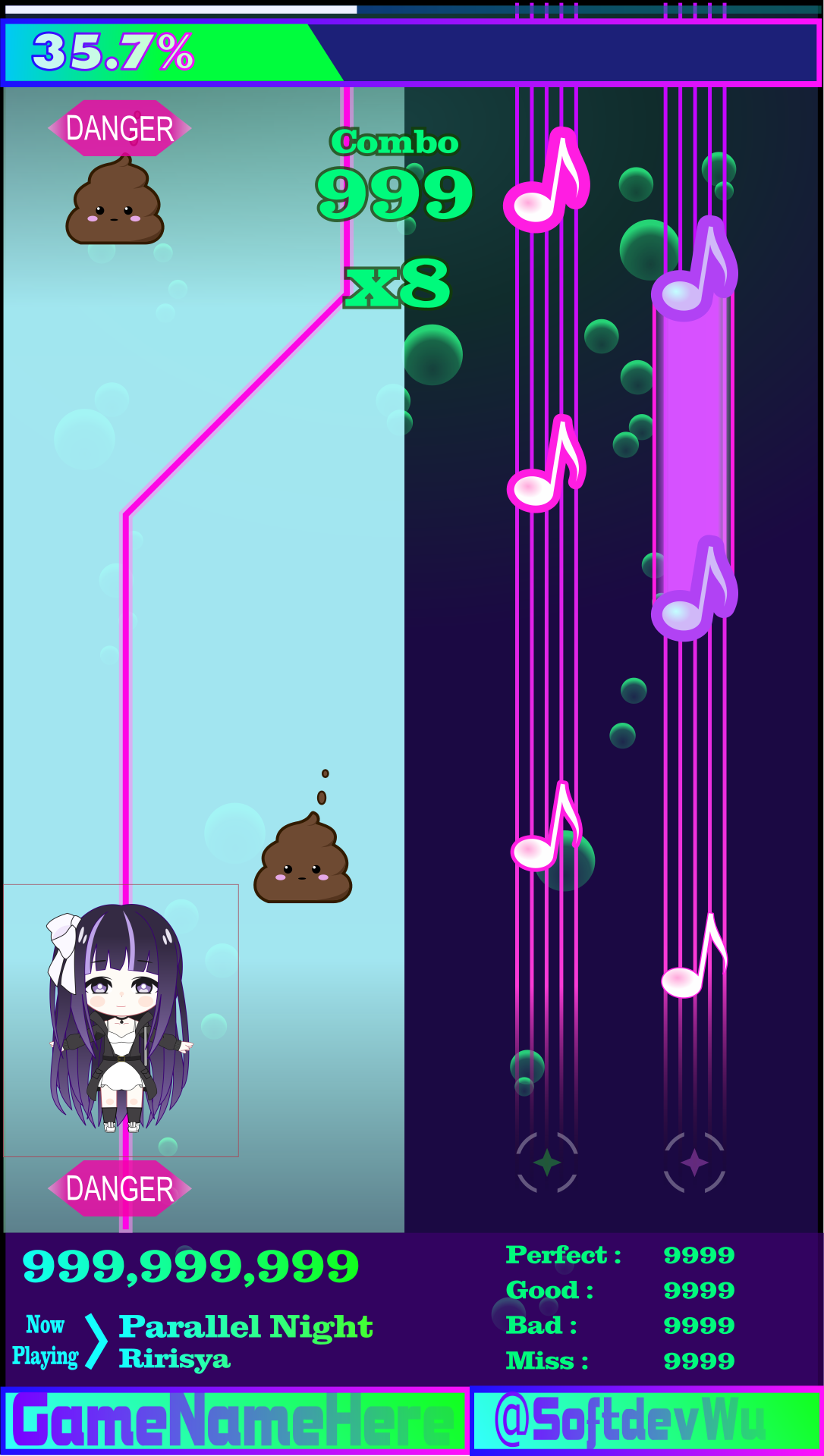
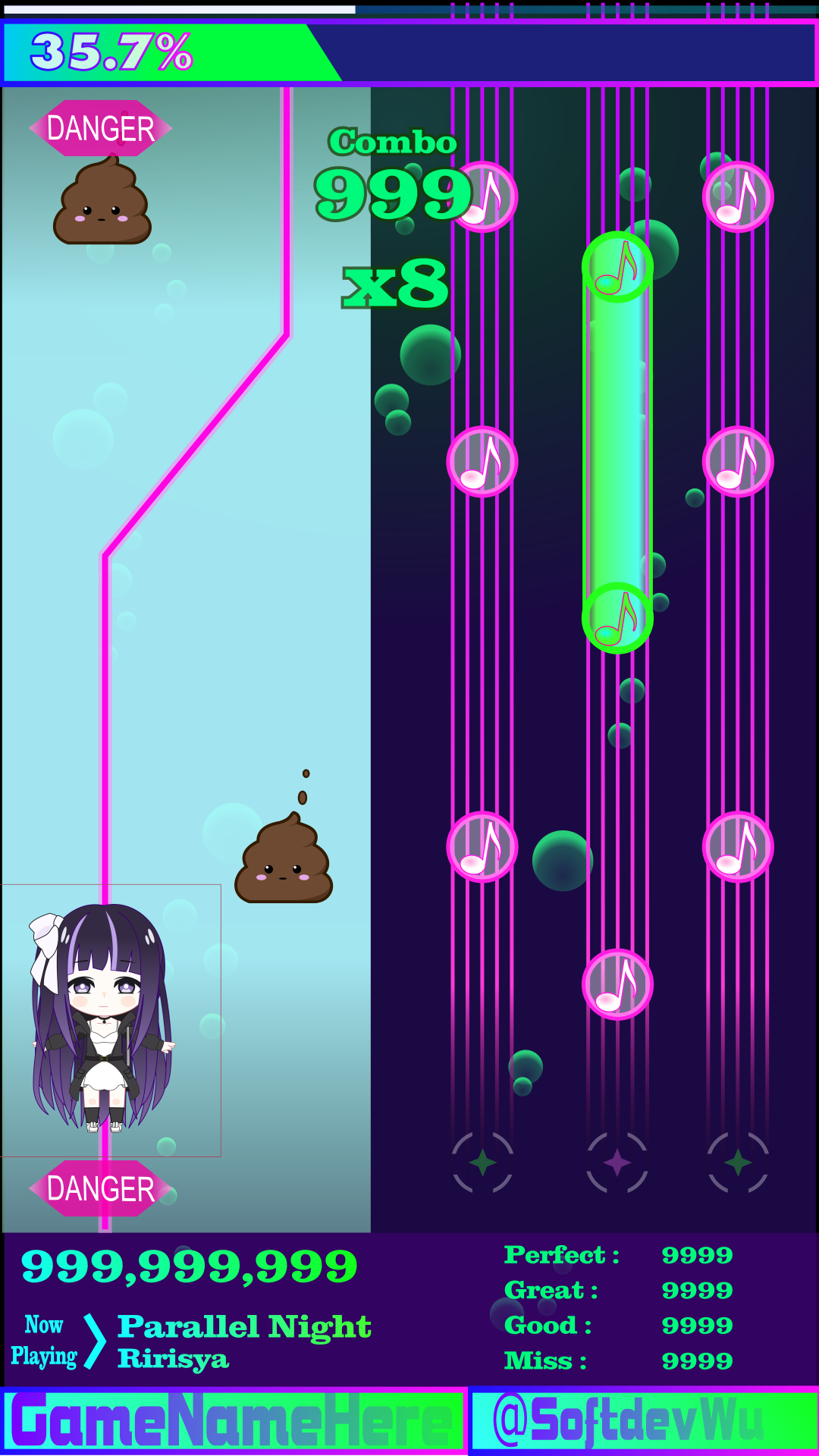
Next, I added a third note lane, since it was looking kinda easy with just only two lanes, and also changed the note sprites to a more symmetrical shape, to make it easier to get the note timing right.
Updated UI and game logo
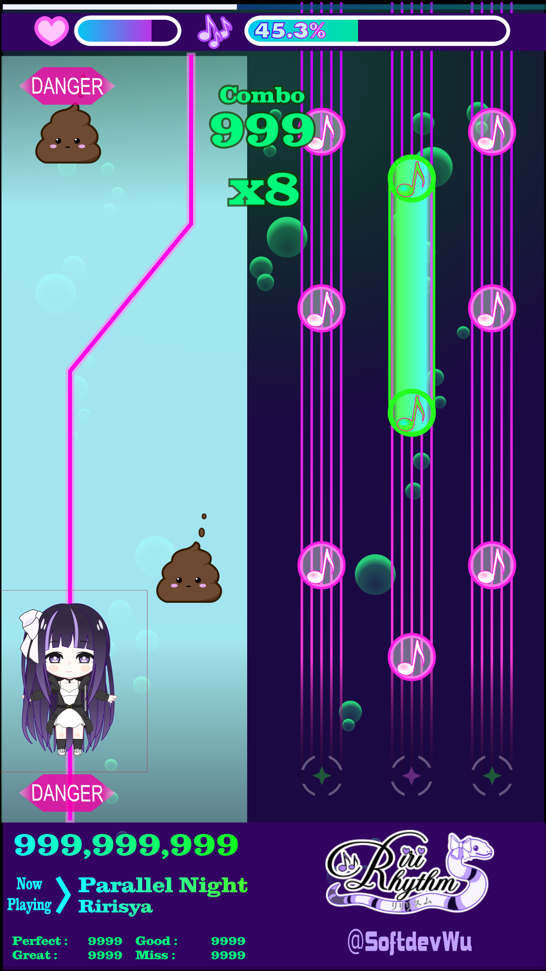
In the next version, I updated the user interface to display a healthbar which would go down when missing notes and getting hit by hazardous projectiles, and get filled when picking up beneficial items.
The UI also includes an accuracy bar, which is used to rank the player performance.
Also at this point in time I finally decided the game name and made a logo for it.
While I was doing all these layout changes I kept working on coding the internal game logic, which would work with any visual layout.
So here's how the game played like at the end of the first week of March, before including any layout changes.
I'll share more of the development progress next week!
If you'd like to support what I do, please consider a donation. :)
Thank you for reading!
Get Riri Rhythm
Riri Rhythm
Rhythm game with Ririsya
| Status | Released |
| Author | David Wu SoftDev |
| Genre | Rhythm |
| Tags | ririsya, vsinger, vtuber |
| Languages | German, English, Spanish; Latin America, French, Indonesian, Italian, Japanese, Korean, Portuguese (Portugal), Russian, Thai |
| Accessibility | Configurable controls |
More posts
- Riri Rhythm v1.0.0Jul 24, 2021
- Riri Rhythm v0.4.0 available for downloadJun 27, 2021
- Riri Rhythm v0.3.0 available for downloadJun 15, 2021
- Progress Report (05/06)Jun 05, 2021
- Riri Rhythm v0.2.0 available for downloadMay 28, 2021
- Progress Report (23/05)May 23, 2021
- Riri Rhythm Progress Report (15/05)May 15, 2021
- Progress Report (10/05)May 10, 2021
- Riri Rhythm v0.1.7 available for downloadApr 30, 2021
- Progress Report (24/04)Apr 24, 2021

Comments
Log in with itch.io to leave a comment.
It looks really good